Tuesday, 29 November 2011

Conditional split vs Multicast Transformation:

Conditional split Transformation:
It is used to split the data based on the conditions. it contains conditional split default output.
Suppose if we have ‘n’ conditions we will get ‘n+1’ outputs.
We can send single record into single destination only that means the records which are satisfied in first condition those records will not come into the second condition.
Multicast Transformation:
It is used to send the data into multiple destinations and we can’t apply any conditions.
We can send single record into multiple destinations.
If we have ‘n’ inputs we will get  ‘n’ outputs.

Sunday, 30 October 2011

Displaying Colors in Data Bars based on conditions

By this time we have seen how Data Bars works. Now let us customize it a little bit for displaying custom colors based on conditions. What we will do is that, if the runs made is greater than or equal to 100 we will display Green Color bars else Red color Bars.
Let us enter the below custom code to our report (Kindly refer to Working with expression section for understanding how to enter custom code to report)
'Function to set the color 
Public Shared Function SetColor(ByVal RunsMade As Integer) As String
SetColor= "Red"
If RunsMade  > 100 Then
SetColor= "Green"
End IF
End Function
The code is simple enough to understand. It will return the color as Red or Green depending on the condition.
Now consider we have designed our report as under (we have already seen this earlier. Henceforth, I am not explaining it again)
45.jpg
Let us select the Data Bar for getting the Chart Data popup. Then right-click on the bar and select Series Properties.
46.jpg
In the Series Properties window, select the Fill tab and click the Expression button (fx).
47.jpg
And in the expression editor enter the below expression
 =Code.SetColor(Fields!RunsMade.Value) 
48.jpg
That's it. Now if we run the report, we will get the desired result
49.jpg
Kindly note that, we have given some gradient effect to our report for beautification.

Displaying Data Labels along with Data Bars

Let us see how we can display the data labels along with the data bars.
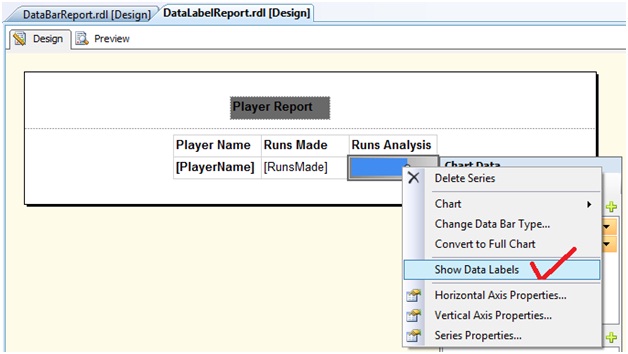
Right click the Data Bar and choose Show Data Labels.
50.jpg
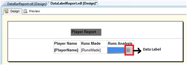
The Data Label appears as shown below
51.jpg
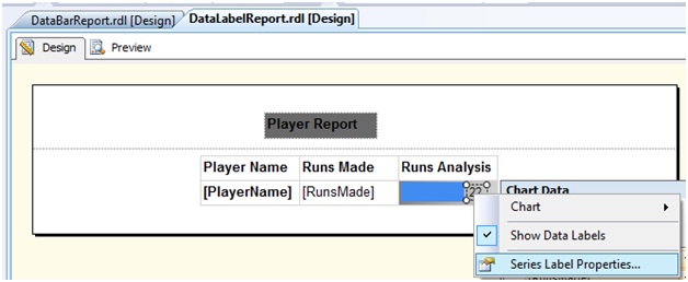
Right click on the data label and choose the Series Label Properties
52.jpg
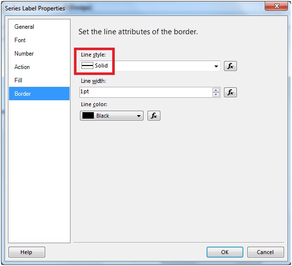
In the Series Label Properties window, go to the Border tab and set the Line Style to Solid.
53.jpg
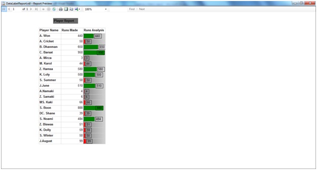
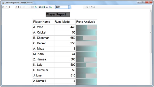
Run the report. As can be figured out that, we now have the Data Bar and the Data Label together.
54.jpg

Working with Data Bars

Data bars are use to make "Tornado charts" in order to get an idea as how values are distributed.
We will use the same data source tbl_Players for this demonstration too.
Objective
In this experiment, we will see how the players runs are distributed using Data Bar.
DataBar into action
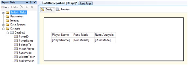
In the design view, add a table with three columns. In the first column, let us add [Player Name] field while in the last two column let us add the [Runs Made] column. Let us rename the header of the third column to [Runs Analysis]
37.jpg
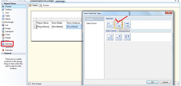
From the Report Item toolbox, let us drag and drop a Data Bar control on to the third column. The Data Bar Type properties window appears. From there let us choose the "Stacked bar" Data Bar type
38.jpg
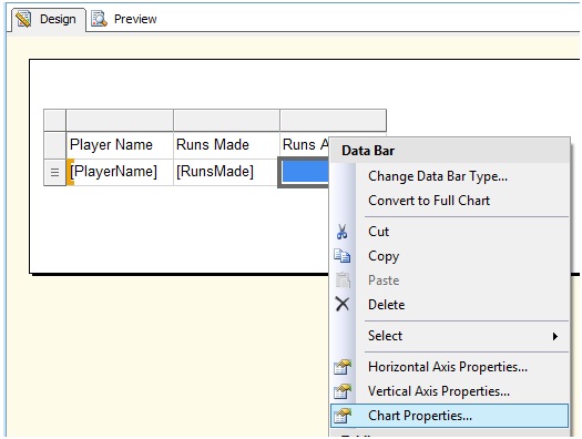
And click OK. Right click on the Data Bar and from the context menu, choose Chart Properties
39.jpg
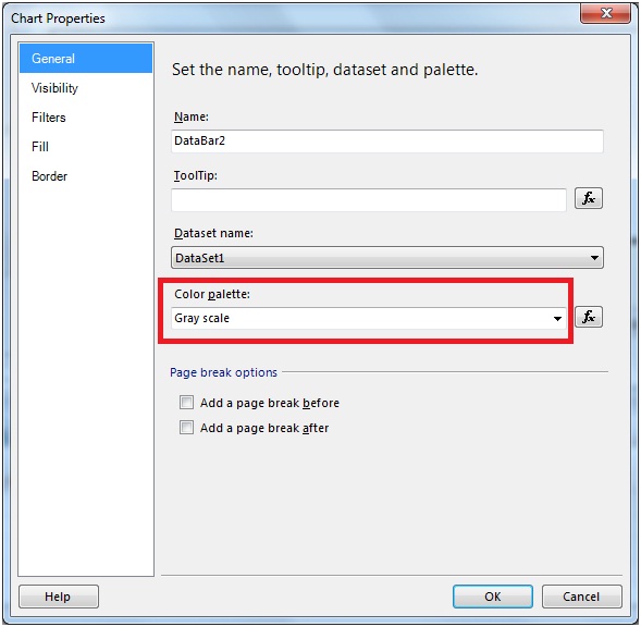
In the General section of the Chart Properties window, choose Gray Scale from the Color Pallet drop down.
40.jpg
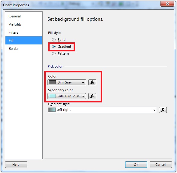
And in the Fill section, choose Gradient in the Fill Style and provide some suitable gradients
41.jpg
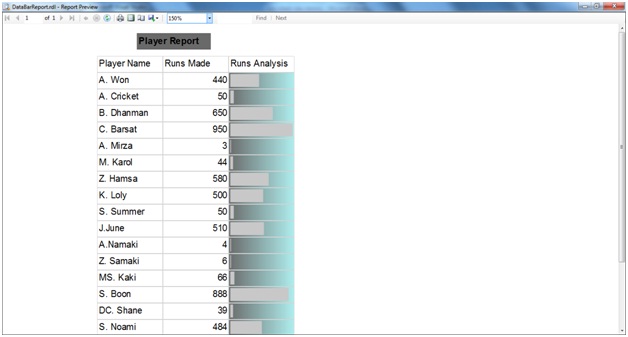
Click OK and view the report
42.jpg
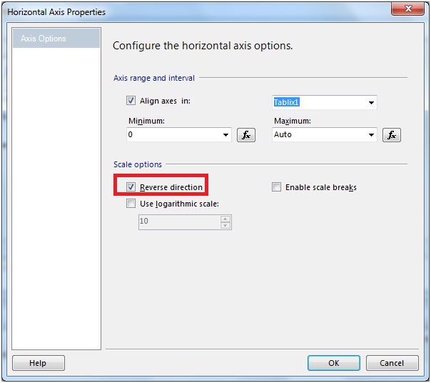
We can reverse the direction of the Data Bars. Right click on the Data Bar and from the context menu,choose Horizontal Axis Properties.From the properties dialog check the Reverse Direction checkbox of the Scale options.
43.jpg
The report is as under
44.jpg

Custom Paging in SSRS report

This section will give us the way of generating custom paging in our report. We will also learn the use of Global variable in doing so.
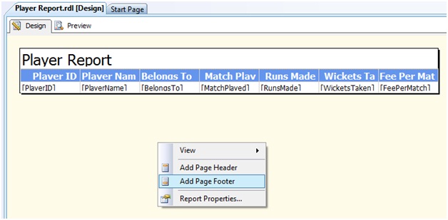
Step 1: In the report design screen, right click and from the context menu, choose Add Page Footer
31.jpg
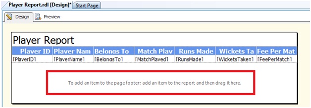
Once the Page Footer is added, we can then add controls to it.
32.jpg
Step 2: Let us add four textboxes from the Report Item toolbox onto the designer as shown under
33.jpg
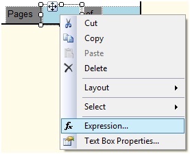
Step 3:Choose the 2nd textbox and click on the Expression
34.jpg
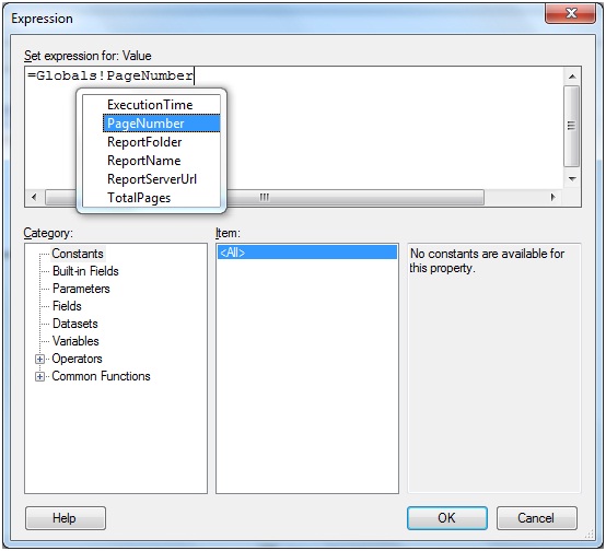
Step 4:From the expression window that opens, let us write the expression
=Globals!PageNumber
35.jpg
Similarly for the 4th Textbox, let us write the expression as =Globals!TotalPages.
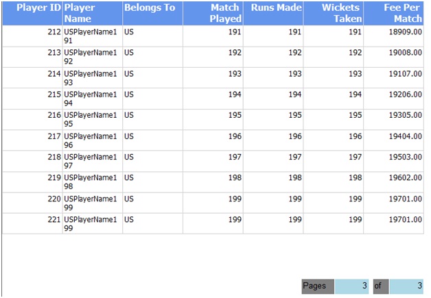
Step 5:Run the report and the output is as under
36.jpg

Working with Calculated fields

A Calculated field is a field that is derived from another field.
Objective
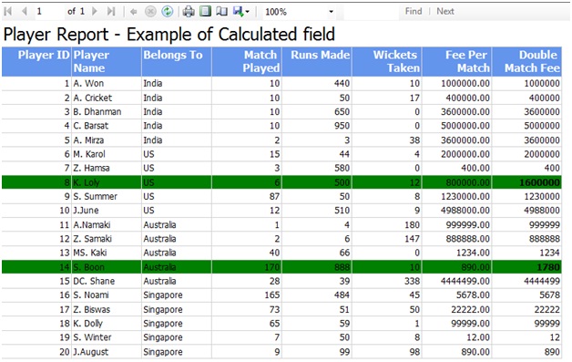
Suppose we want to twice the match fee for every player who ever has bagged more than 10 wickets and made a score of more than 500 runs. In such a case, that row will be will be green colored and the Calculated column value will be made bold.
Solution
Step 1: As a first step let us write the custom codes
Function: SetColor
Purpose: This function will set the color for the entire row to green if the runs made are more than or equals to 500 and wickets taken are more than or equals to 10.
Function: SetBoldFontWeight
Purpose: This function will set the Row data to Bold for the Calculated column where the runs made by the Player are more than or equal to 500 and wickets taken are more than or equal to 10.
Function: DoubleMatchFee
Purpose: Doubles the player match fees if the runs made by the Player are more than or equal to 500 and wickets taken are more than or equal to 10.
'Function to double the match fee
Public Shared Function DoubleMatchFee(ByVal RunsMade As Integer,ByVal WicketsTaken As Integer,ByVal OriginalMatchFee As Integer) As Integer
DoubleMatchFee= OriginalMatchFee 
If RunsMade   >= 500  AND  WicketsTaken >= 10 Then
DoubleMatchFee= OriginalMatchFee * 2
End IF
End Function
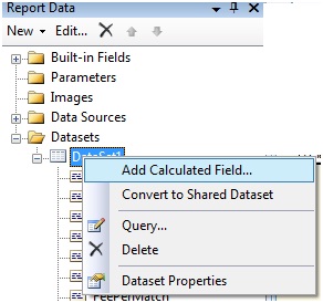
Step 2: Choose Data Set. Right Click and choose Add Calculated field
21.jpg
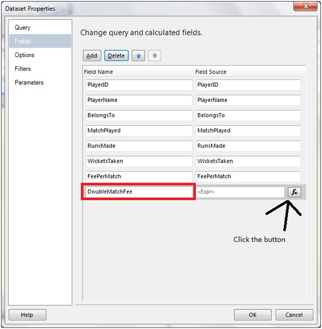
The DataSet Properties window opens up. Enter a Calculated field Name and click on the Expression button (fx)
22.jpg
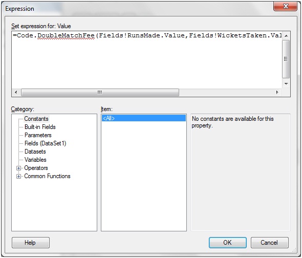
Next Add the below expression in the expression window
23.jpg
Click OK.
Step 3: Drag and drop the DoubleMatchFee column to the Report Designer.
24.jpg
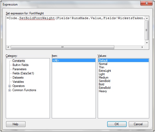
Right click on the DoubleMatch Fee column and from the text box properties choose Font and let us write the below expression against the Bold Font Weight
=Code.SetBoldFontWeight(Fields!RunsMade.Value,Fields!WicketsTaken.Value)
25.jpg
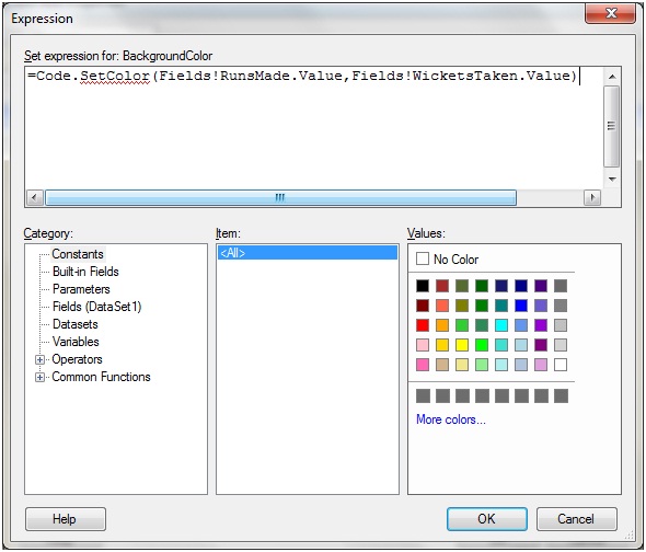
For all other columns, let us enter the below expression against the Fill color obtained from the Text Box Properties
=Code.SetColor(Fields!RunsMade.Value,Fields!WicketsTaken.Value)
26.jpg
And we are done. Let us run the report and the output is as under
27.jpg
Hope that we are now comfortable to work with calculated filed.

Working with Expressions and Custom code in SSRS

In this section we will see how to use expression and custom code in our Report. We will learn these through some examples Objective
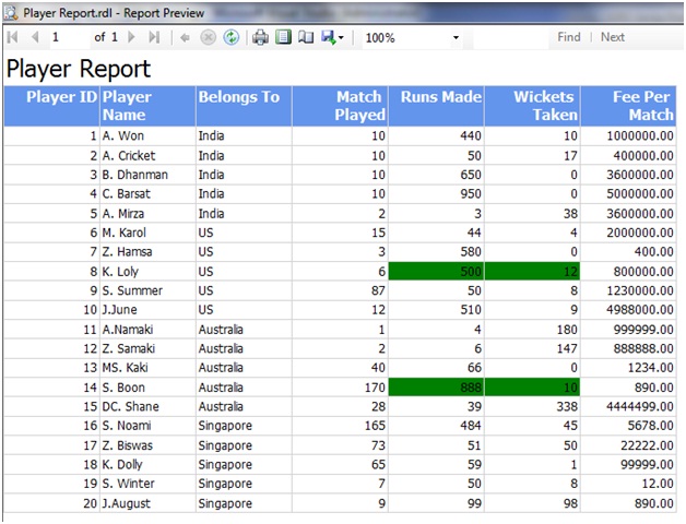
What we are going to do is that, if a player has made more than 500 runs and has taken more than 10 wickets, then we are going to display the row and the particular columns with green color
For this, let us first click on the report design body and choose the report properties
9.jpg
The Report Properties window opens up as shown under
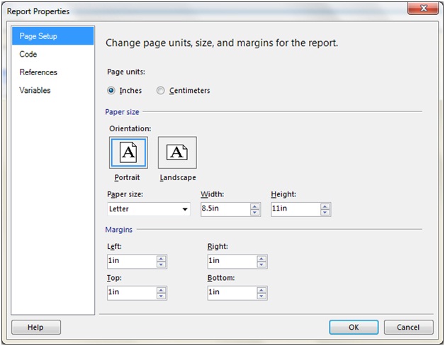
10.jpg
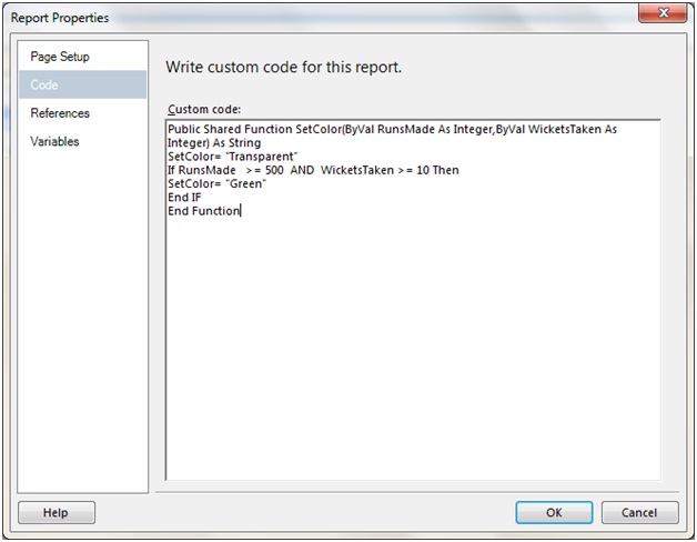
Navigate to the Code tab for writing the below custom code
Public Shared Function SetColor(ByVal RunsMade As Integer,ByVal WicketsTaken As Integer) As String
SetColor= "Transparent"
If RunsMade   >= 500  AND  WicketsTaken >= 10 Then
SetColor= "Green"
End IF
End Function
The code is pretty simple to understand. We have declare a function by the name SetColor which accepts two integer variable,the first for the run and the next for the wickets taken. We set the initial value of the Setcolor to "Transparent" . Now if the condition meets , we will set the SetColor to "Green".
11.jpg
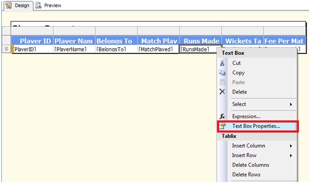
Next let us choose the RunsMade column and right click to open the TextBox menu from which we will choose the TextBox Properties
12.jpg
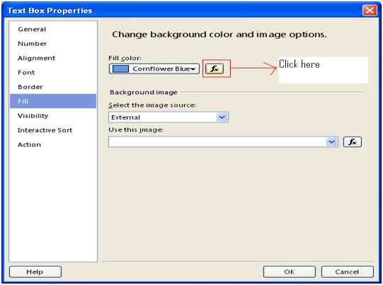
In the TextBox Properties window that appears, click on the Fill option and click the fx Button.
13.jpg
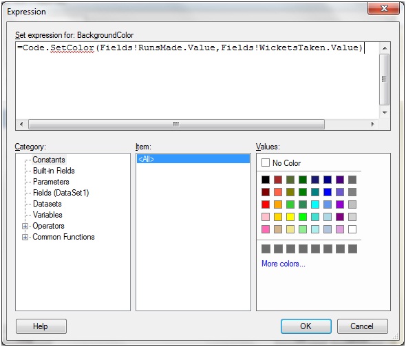
Enter the below expression in the Expression Window
=Code.SetColor(Fields!RunsMade.Value,Fields!WicketsTaken.Value)
Again the argument passing code snippet is very simple. In the first one, we are passing the RunsMade values while in the second we are passing the WicketsTaken values in the SetColor function that we just created.
14.jpg
Click OK button and repeat the same for the Wickets Taken column.Once done, let us run the application and the result is as under
15.jpg
Let us add some more customization to our report. If the above criterion satisfies, we will make the Player Name value as bold and the Belongs To as Italic.
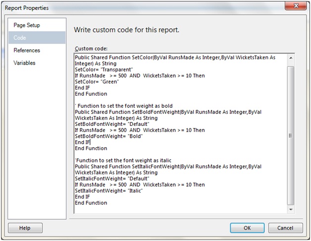
So let us add two more functions in the Custom Code as under.
Function : SetBoldFontWeight
' Function to set the font weight as bold
Public Shared Function SetBoldFontWeight(ByVal RunsMade As Integer,ByVal WicketsTaken As Integer) As String
SetBoldFontWeight= "Default"
If RunsMade   >= 500  AND  WicketsTaken >= 10 Then
SetBoldFontWeight= "Bold"
End IF
End Function
Function : SetItalicFontWeight
'Function to set the font weight as italic
Public Shared Function SetItalicFontWeight(ByVal RunsMade As Integer,ByVal WicketsTaken As Integer) As String
SetItalicFontWeight= "Default"
If RunsMade   >= 500  AND  WicketsTaken >= 10 Then
SetItalicFontWeight= "Italic"
End IF
End Function
The Custom Code area will now look as under
16.jpg
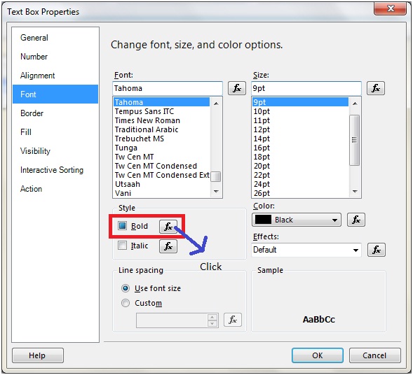
Next in the PlayerName column right click to bring the TextBox properties and from the Font option, choose the fn for Bold
17.jpg
In the expression editor enter the below code
=Code.SetBoldFontWeight(Fields!RunsMade.Value,Fields!WicketsTaken.Value)
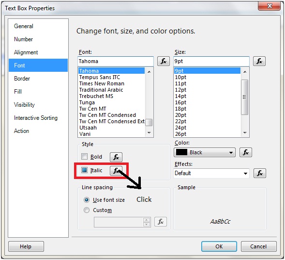
In the Belongs To column right click to bring the TextBox properties and from the Font option, choose the fn for Italic
18.jpg
In the expression editor enter the below code
=Code.SetItalicFontWeight(Fields!RunsMade.Value,Fields!WicketsTaken.Value).
We are done. Run the report and the result is as under
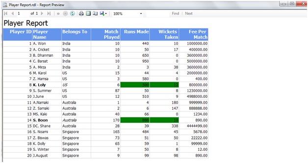
19.jpg
We will look into one more situation where we will generate alternate row color based on the Player ID column.
For this purpose add the below function in the custom codewindow
Public Shared Function SetAlternateRowColor(ByVal PlayerID As Integer) As String
SetAlternateRowColor= "Yellow"
If PlayerID Mod 2 = 0 Then
SetAlternateRowColor= "Green"
End IF
End Function
In this code, we are setting the color for even rows as Green .And for all the columns, let us write the below expression for the BackgroundColor
=Code.SetAlternateRowColor(Fields!PlayerID.Value)
The result is as under
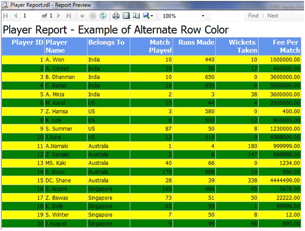
20.jpg
Similarly we can set the alignments, hide rows depending on condition and many more stuffs by using expression and custom code.

Creating a DrillDownReport in SSRS

Creating a drill down / Tree view report in SSRs is very simple.Let us see the following steps to do so.
Step 1: Open BIDS and creatre a new Shared Data Source
Step 2: Create a Table type report as shown below (The steps for doing so has been described in Part I series).
69.jpg
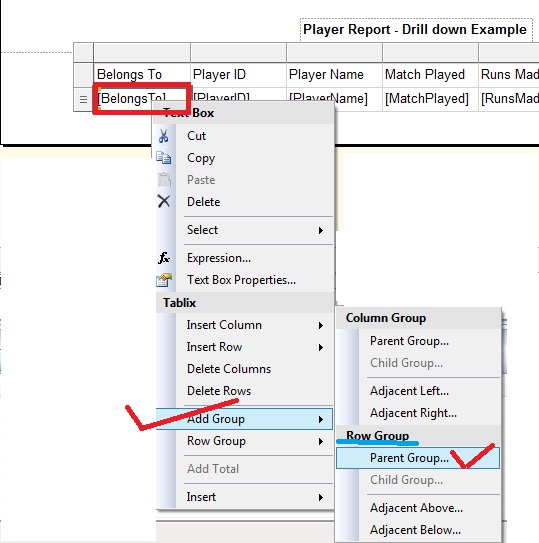
Step3: Next add Parent Group for Belongss To field as depicted under
70.jpg
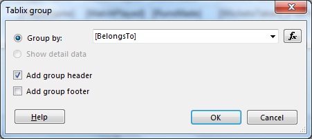
Step 4: From the Tablix Group window, let us choose [BelongsTo] from Group By DropDown and check Add Group Header checkbox, then click OK.
71.jpg
At this point if we the report looks as under in the design view
72.jpg
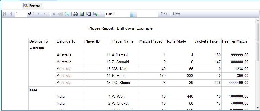
While running the report gives the below impression in the Preview tab
73.jpg
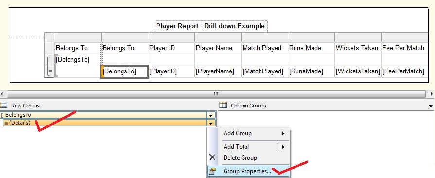
Step 5: From Row groups, choose [Belongs To] Details and then choose Group Properties
74.jpg
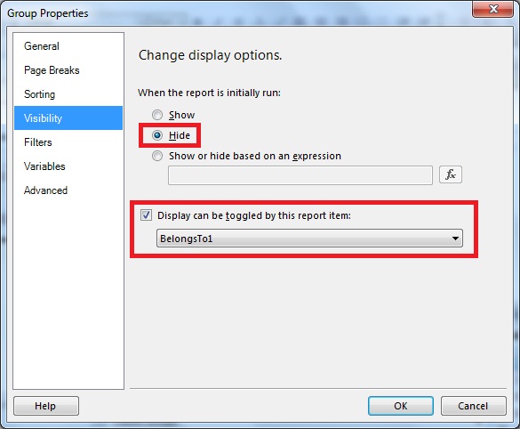
Step 6: From the Group Properties window that opens up, choose Visibility tab. Then select Hide radio button and check the Display can be toggled by this report item checkbox.Then from the drop down that will be enable,select the name of the group (which is BelongsTo1 here) then click on OK
75.jpg
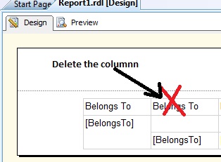
Step 7: Delete the [Belongs To] Details column
76.jpg
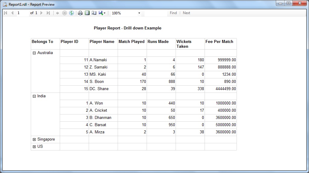
Step 8: Now it's all done. Run the application and the output is as under
77.jpg

SSIS: Creating Package Configurations

This post discusses the creation of Configuration Files and how they can be useful while migrating a package from one environment to an...