We will use the same data source tbl_Players for this demonstration too.
Objective
In this experiment, we will see how the players runs are distributed using Data Bar.
DataBar into action
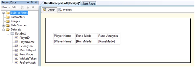
In the design view, add a table with three columns. In the first column, let us add [Player Name] field while in the last two column let us add the [Runs Made] column. Let us rename the header of the third column to [Runs Analysis]
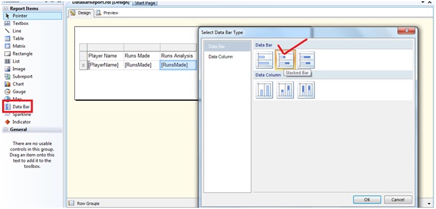
From the Report Item toolbox, let us drag and drop a Data Bar control on to the third column. The Data Bar Type properties window appears. From there let us choose the "Stacked bar" Data Bar type
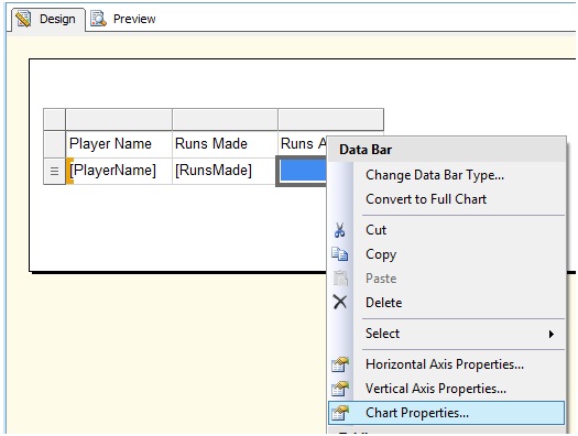
And click OK. Right click on the Data Bar and from the context menu, choose Chart Properties
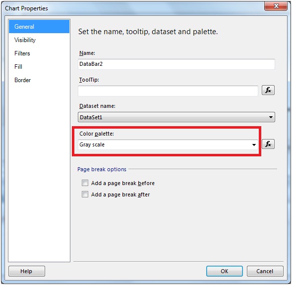
In the General section of the Chart Properties window, choose Gray Scale from the Color Pallet drop down.
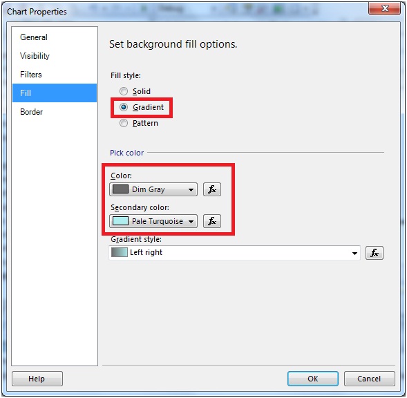
And in the Fill section, choose Gradient in the Fill Style and provide some suitable gradients
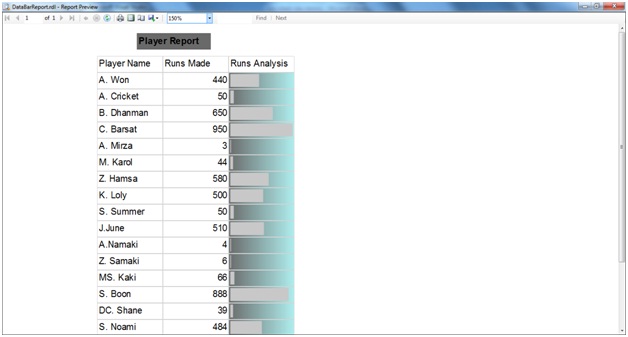
Click OK and view the report
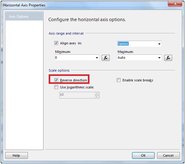
We can reverse the direction of the Data Bars. Right click on the Data Bar and from the context menu,choose Horizontal Axis Properties.From the properties dialog check the Reverse Direction checkbox of the Scale options.
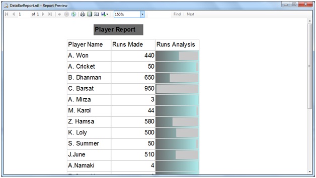
The report is as under

No comments:
Post a Comment